- Subscribe to RSS Feed
- Mark Topic as New
- Mark Topic as Read
- Float this Topic for Current User
- Bookmark
- Subscribe
- Mute
- Printer Friendly Page
Plot Graph with Explicit X-axis values and Report with Explicit X-axis Title
Solved!02-08-2016 12:25 PM - edited 02-08-2016 12:28 PM
- Mark as New
- Bookmark
- Subscribe
- Mute
- Subscribe to RSS Feed
- Permalink
- Report to a Moderator
Hi all!
While working with graphs and report generator toolkit, I am facing two issues.
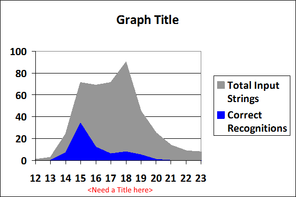
In the report generation in Excel, it's actually making nice graphics, but somehow I don't see the option to add a title for "X axis" or "Y axis". There is an option for Graph Title, but not for the Axis title. See the image please.
The second issue is with the Graph control/indicator.
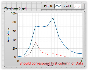
As you can see in the above image, the X axis has data points which are not like index (0-n) but some specific points. In the Waveform Graph, I have to use only the two columns (the gray and blue data) and cannot use the data that has those values of X axis. So it generates the graph, but not quite as I would like it to be. As in the following image.
I cannot find a property value to assign the explicit values to X-axis. I am not talking about the range of X axis. I am talking about projecting my data on X axis (as in the first image above). Of course, unlike in the case of report generator, I am not providing the first colmn data, so obviously it's not going to project it. But I could not find how can I send that data to project as in the first image.
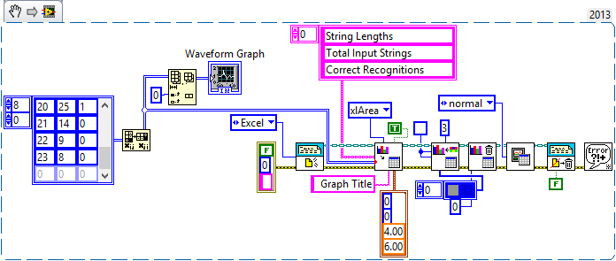
Here is my program.
Thanks ahead!
Solved! Go to Solution.
02-08-2016 01:51 PM
- Mark as New
- Bookmark
- Subscribe
- Mute
- Subscribe to RSS Feed
- Permalink
- Report to a Moderator
In terms of your second problem, you are using the wrong XY Graph data type. If you check context help you will see that it supports several datatypes. The one I use a lot is a cluster containing an array of x values and a corresponding array of y values. A multiplot is then just an array of those clusters.
Mike...
Certified Professional Instructor
Certified LabVIEW Architect
LabVIEW Champion
"... after all, He's not a tame lion..."
For help with grief and grieving.
02-08-2016 01:52 PM
- Mark as New
- Bookmark
- Subscribe
- Mute
- Subscribe to RSS Feed
- Permalink
- Report to a Moderator
02-08-2016 02:04 PM
- Mark as New
- Bookmark
- Subscribe
- Mute
- Subscribe to RSS Feed
- Permalink
- Report to a Moderator
So replace the waveform graph like Gerd says, with an XY, ***then*** feed it the right data structure.
Mike...
Certified Professional Instructor
Certified LabVIEW Architect
LabVIEW Champion
"... after all, He's not a tame lion..."
For help with grief and grieving.
02-08-2016 02:51 PM
- Mark as New
- Bookmark
- Subscribe
- Mute
- Subscribe to RSS Feed
- Permalink
- Report to a Moderator
@Vaibhav wrote:Hi all!
While working with graphs and report generator toolkit, I am facing two issues.
In the report generation in Excel, it's actually making nice graphics, but somehow I don't see the option to add a title for "X axis" or "Y axis". There is an option for Graph Title, but not for the Axis title. See the image please.
It's really counterintuitive, you need to use Excel Set Graph Font.vi (xlCategory for the x-axis, xlValue for the y-axis).
Ben64
02-09-2016 06:38 AM
- Mark as New
- Bookmark
- Subscribe
- Mute
- Subscribe to RSS Feed
- Permalink
- Report to a Moderator
@Mike
@GerdW
Thanks. I had tried to XY graph before, but somehow I couldn't manage to present my data correctly, and the example of Waveform Graph convinced me it was easy.
But after your suggestion, read the help more carefully, and tried making the cluster array for multiplot (I was earlier trying with single plot, because I thought multiplot will make 2 separate plots in one window). And it works now as it shows in the Excel's chart.
@Ben
Yes, it's indeed counterintuitive. I always ignored that vi because I didn't want to set font. ![]()
It works now.
Posting the updated program for anyone else learning about LabVIEW graphs and report generation.
I would however like to make the Y-axis label (string counts) vertical. Couldn't find that option. Anyone?
02-16-2016 09:23 AM
- Mark as New
- Bookmark
- Subscribe
- Mute
- Subscribe to RSS Feed
- Permalink
- Report to a Moderator
@Vaibhav wrote:
I would however like to make the Y-axis label (string counts) vertical. Couldn't find that option. Anyone?
It is not available with the Report Generation Toolkit vis (althought in my opinion it should be since it is not a big modification of Excel Set Graph Font.vi). You will have to use ActiveX to do it.
Ben64
02-16-2016 10:22 AM
- Mark as New
- Bookmark
- Subscribe
- Mute
- Subscribe to RSS Feed
- Permalink
- Report to a Moderator
ben64 escreveu
You will have to use ActiveX to do it.
Ben64
Hi Ben,
Thanks for the suggestion.
But how is it possible? Because we're talking about a chart that is being prepared inside the excel, and the chart was already prepared in the report. Can you please give an example?
02-16-2016 03:23 PM
- Mark as New
- Bookmark
- Subscribe
- Mute
- Subscribe to RSS Feed
- Permalink
- Report to a Moderator
02-17-2016 12:02 PM
- Mark as New
- Bookmark
- Subscribe
- Mute
- Subscribe to RSS Feed
- Permalink
- Report to a Moderator
Thanks Ben,
Can you please convert the VI to 2013? I still haven't got DVDs for 2014 onwards.


