- Subscribe to RSS Feed
- Mark Topic as New
- Mark Topic as Read
- Float this Topic for Current User
- Bookmark
- Subscribe
- Mute
- Printer Friendly Page
Mixed signal graph gone crazy
04-10-2015 07:53 AM - edited 04-10-2015 08:06 AM
- Mark as New
- Bookmark
- Subscribe
- Mute
- Subscribe to RSS Feed
- Permalink
- Report to a Moderator
I have a graph that simultaneously represents a jerk profile and its corresponding acceleration, speed and position charts. I am automatically adjusting the 4 different Y-axes to reflect the correct values; for this I first adjust the X-axis multiplier using a user-defined time variable (so the total number of samples corresponds to a certain number of seconds) and then I try to apply this multiplier to the different Y-axes.
I have created a property node for the Mixed Signal Graph and written the "ActiveYScl" property and then adjusted the YScale.Multiplier for that YScale accordingly.
The problem I am having is that after modifying programatically the time value the legends of the Y scales are no longer visible (I used to be able to see all 4 of them), and all I can manage by dragging the graph with the hand from the graph palette is to partially see the last legend. As you can see in the attached images when the graph gets redrawn the X scale goes completely out of the graph, leaving the first part without drawing.
Any idea of whan could have gone wrong?
Edit: to clarify, MSG3.png shows what the graph looks like before it gets messed up.
04-10-2015 08:53 AM
- Mark as New
- Bookmark
- Subscribe
- Mute
- Subscribe to RSS Feed
- Permalink
- Report to a Moderator
That looks like a known feature of the MSG improperly resizing with the panel.
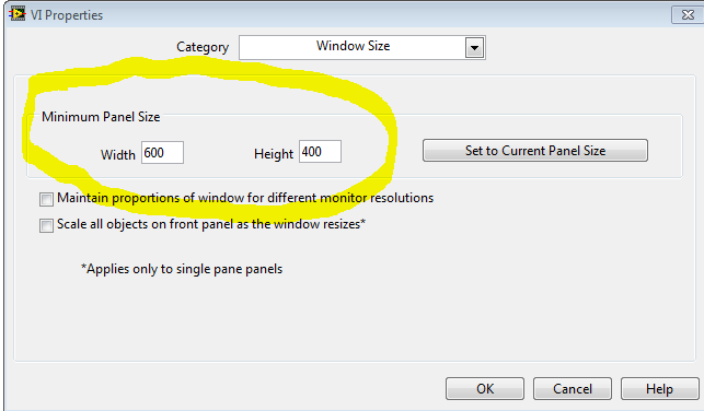
It is probably best to set a minimum size for the vi (VI Properties>> Window Size)
Then the user can't cause the problem
"Should be" isn't "Is" -Jay
04-10-2015 09:30 AM
- Mark as New
- Bookmark
- Subscribe
- Mute
- Subscribe to RSS Feed
- Permalink
- Report to a Moderator
Thanks Jeff,
I have set a higer value now for the new version where I rebuilt the graph from scratch (changing it on the old one with the messed up graph had no effect though). For now it´s working, let's see if it stays so!

