- Subscribe to RSS Feed
- Mark Topic as New
- Mark Topic as Read
- Float this Topic for Current User
- Bookmark
- Subscribe
- Mute
- Printer Friendly Page
Integer Graph Labels on Error Bars
Solved!07-20-2017 04:22 AM
- Mark as New
- Bookmark
- Subscribe
- Mute
- Subscribe to RSS Feed
- Permalink
- Report to a Moderator
Hi,
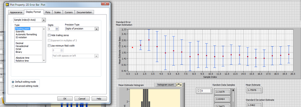
Trying to do a relatively simple stats VI which displays the mean estimates and the error bars associated with them. When I set the x-axis on the error bar graph to
Properties - Display Format - Type - Decimal
The tick marks appear like
0 2 2 4 4 6 6 8 8 ... 20 20
Rather than the increasing sequence
0 1 2 3 4 5
The floating point representation is displayed ok, but it would be better to have integer values.
Any ideas?
Thanks, Martin
Solved! Go to Solution.
07-20-2017 07:24 AM
- Mark as New
- Bookmark
- Subscribe
- Mute
- Subscribe to RSS Feed
- Permalink
- Report to a Moderator
I ran your code and generated the following graph:
I then went into the Graph Properties, turned off AutoScale on the Y Axis, set the minimum to 0 and the maximum to 5 (which did most of the work, but still left the grid markings 0.00, 1.00, etc), then went to Display Format and changed the Y display to Decimal, giving this:
I did this "manually", looking at the graph. You can also do this programmatically, using Graph Property Nodes. You'll need to find the Max and Min of the Error Bars yourself, and if you want integer scale labels, will need to do the appropriate rounding up and down.
Bob Schor
07-21-2017 03:40 AM
- Mark as New
- Bookmark
- Subscribe
- Mute
- Subscribe to RSS Feed
- Permalink
- Report to a Moderator
Hi, Thanks for replying. I was mainly interested in the problem of integers on the x-axis, but somehow fiddling with the settings may be the best workaround. I do know the maximum number of iterations and could possibly program this, but I was after the display evolving so it could be paused near the start and the graph looked at in detail. Then letting it run its course and seeing the general shape at the end. Fixing the x-axis min and max wouldn't allow this in this case.
However, I'm still surprised about the doubling up of the integers on the x-axis as it does look strange (at best).
07-21-2017 04:10 AM - edited 07-21-2017 04:10 AM
- Mark as New
- Bookmark
- Subscribe
- Mute
- Subscribe to RSS Feed
- Permalink
- Report to a Moderator
Hi MartinQ,
I'm still surprised about the doubling up of the integers on the x-axis as it does look strange
See this:
Setting a reasonable formatting shows the "problem": when rounding to integer display "bankers rounding" is used. (It's default rounding behaviour for floating point numbers!)
07-21-2017 05:08 AM
- Mark as New
- Bookmark
- Subscribe
- Mute
- Subscribe to RSS Feed
- Permalink
- Report to a Moderator
Yeah, that's what I'd done as a workaround. For the students who will be looking at it though, it would be more obvious if only the sample integer index was displayed on the x-axis, rather than floating point numbers. Thanks.
07-21-2017 05:31 AM
- Mark as New
- Bookmark
- Subscribe
- Mute
- Subscribe to RSS Feed
- Permalink
- Report to a Moderator
Using the
Create - Property Node
to set the Xscale.Minimum and Maximum and then hooking the maximum into the loop in the block diagram gives the display I was after (vi attached). Still a bit surprised at the auto formatting display though.


