- Subscribe to RSS Feed
- Mark Topic as New
- Mark Topic as Read
- Float this Topic for Current User
- Bookmark
- Subscribe
- Mute
- Printer Friendly Page
Data dashboard custom graph
11-20-2013 10:59 PM - edited 11-20-2013 11:01 PM
- Mark as New
- Bookmark
- Subscribe
- Mute
- Subscribe to RSS Feed
- Permalink
- Report to a Moderator
Is there a way to make a custom graph in data dashboard. I am trying to get a Gaussian distribution to display on my phone from labview however I am not able to do so. Has anyone had luck getting a graph like this to show up on their phone? or tablet?
Is there a way to create your own graph. I have not be able to find any answers.
I am using an android device for both the tablet and phone.
Thanks
11-21-2013 08:59 AM
- Mark as New
- Bookmark
- Subscribe
- Mute
- Subscribe to RSS Feed
- Permalink
- Report to a Moderator
Hi Jrod,
Data Dashboard 1 only has a chart indicator, so you won't be able to display this particular type of data. Data Dashboard 2 has a graph which you can pass an array of points and therefore could display a Gaussian distribution. Right now Data Dashboard 2 is available for iPad only, but as announced at NIWeek, we are hard at work bringing Data Dashboard 2 to Android Tablets.
NI App Software R&D
12-13-2013 03:56 PM - edited 12-13-2013 04:01 PM
- Mark as New
- Bookmark
- Subscribe
- Mute
- Subscribe to RSS Feed
- Permalink
- Report to a Moderator
Mark,
I finally got my hands on a ipad mini. I was wondering what graph I would have to use and how to pass the array of data? Is there a tutorial on how to do this or any other examples that could help me whith this.
I am still trying to get a gaussian distribution or even a histogram will do.
Thanks
Juan
12-13-2013 04:01 PM
- Mark as New
- Bookmark
- Subscribe
- Mute
- Subscribe to RSS Feed
- Permalink
- Report to a Moderator
In Data Dashboard 2.0 , the graph you'll want to use is the XY Graph.
This thread explains the correct data type to use and how to construct it for shared variables:
You can use the same approach if you're working with web services. If you have a web method that returns the correct data type, Data Dashboard should give you the option to create an XY Graph when you've started the linking process for that output terminal.
12-13-2013 04:05 PM - edited 12-13-2013 04:08 PM
- Mark as New
- Bookmark
- Subscribe
- Mute
- Subscribe to RSS Feed
- Permalink
- Report to a Moderator
Hi Juan,
Take a look at this guide and let me know if you have any questions.
Getting Started with Data Dashboard for LabVIEW
Cheers,
Brandon V.
12-14-2013 02:31 PM
- Mark as New
- Bookmark
- Subscribe
- Mute
- Subscribe to RSS Feed
- Permalink
- Report to a Moderator
So i started working on this part using the information from this ling below as suggested from a post above.
The can anyone help me out with out to create a custom control? How do I go about this? I tried following this tutorial
But I am not sure what I have to change for the control
Thanks for the help
12-15-2013 12:51 PM
- Mark as New
- Bookmark
- Subscribe
- Mute
- Subscribe to RSS Feed
- Permalink
- Report to a Moderator
I fianlly was able to get the custom control to work. Was really easy thanks for the help. So I am un sure how to connect my data to the shared variable. I have tried connecting two arrays to a bundle and then to the shared variable and it gives me an error. I have tried to make sure that both arrays are the same data type and still an error.
I have tired to connect a build array to make sure that it is in the correct data type as my variable but I am not sure if I am doing this part correctly.
I have up loaded a pic of the error and the schematic. I am out of ideas on how to get this to work.
The only other thing that I have not tried was to expand the build array to add another element, but I am not sure what else to add to the build array.
Thanks for the help
12-16-2013 10:52 AM
- Mark as New
- Bookmark
- Subscribe
- Mute
- Subscribe to RSS Feed
- Permalink
- Report to a Moderator
Hi Juan,
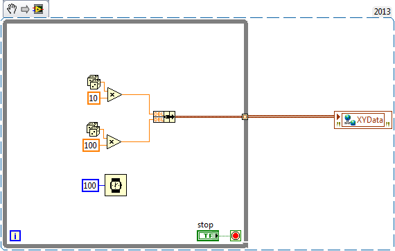
It looks like you have the custom control and the shared variable setup correctly. Now you need to create clusters of 2 points and create an array of those clusters. Here's an example:
I am creating a cluster of 2 doubles, and the indexing tunnel on the while loop creates an array of those clusters.
Cheers,
Brandon V.
12-16-2013 10:53 AM
- Mark as New
- Bookmark
- Subscribe
- Mute
- Subscribe to RSS Feed
- Permalink
- Report to a Moderator
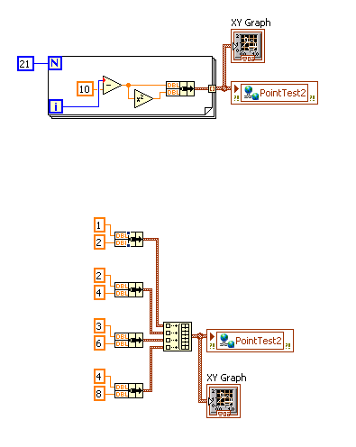
Here are two examples of building a point array (for an XY Graph) that can be used with Data Dashboard:
The top example is y=x^2 from x=-10 to x=10, illustrating what you might do if you're using a For loop to construct your data.
The bottom example is more simple: The result is just an XY Graph with a line connecting 4 points: (1,2) (2,4) (3,6) and (4,8).
The issue with your first screenshot (Capture.JPG) is that you're taking two arrays of numeric data, and bundling them into a cluster. (So, a cluster of 2 numeric arrays).
Instead, what you should use is a single array of data, where each element in the array is a cluster of 2 numeric values.
12-16-2013 09:56 PM
- Mark as New
- Bookmark
- Subscribe
- Mute
- Subscribe to RSS Feed
- Permalink
- Report to a Moderator
Malcolmsmith solution is the one that worked for me in the set up.
Thanks for the help.
Now what I will be doing is trying to display a histogram graph onto the data dashboard graph. From the post above, this would need to be an XY graph. Now I am going to simulate a digital signal with a square wave generator and change the amplitude to get a different number out to the graph. Now I have been trying this all day with no luck because I can not get the correct data type for my variable.
Does this mean that I have to change the data type of my shared variable? Or is it possible to manipulate the data using labview functions to get the correct data type?
Thanks


