From Friday, April 19th (11:00 PM CDT) through Saturday, April 20th (2:00 PM CDT), 2024, ni.com will undergo system upgrades that may result in temporary service interruption.

We appreciate your patience as we improve our online experience.

LabVIEW Idea Exchange

cancel
Showing results for 
Search instead for 
Did you mean: 
X.

Restore High Contrast Icons

Status: New

For those of you who haven't signed up yet, you should go and have a look at the Next Generation LabVIEW Features Technology Preview (a mouthful, but in short, it is a UI and Development Environment demonstration version of what NI is cooking up for future versions of LabVIEW). There are some cool things and some downright awful ones.

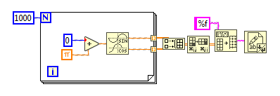
One of them has been sneaking its ugly neck in LabVIEW 2016: reduced contrast. I am (my eyes) getting tired of it. A few examples of the changes introduced in 2016 are shown below:


2015:

Screen Shot 2016-10-29 at 10.10.59.png

2016:

Screen Shot 2016-10-29 at 10.12.28.png


Considering that the trend is for displays to not increase that much in size but increase in resolution, we have now to factors to fight against: the reduction in size AND the reduction in contrast. I won't mention laptop displays going in economy mode and reducing their luminosity, but the point is that it is making LabVIEW even more difficult and unengaging to use. Way to go to loose any chance to attract new users, and run the risk to loose old timers due to added eye strain.


Put simply: Restore high contrast icons  and please, do not go ahead with the washed out IDE and UI objects showcased in Tech Preview.


41 Comments
X.
Trusted Enthusiast
Trusted Enthusiast

I have go this on my Mac:


Screen Shot 2016-11-15 at 13.05.51.png

Just provide this option in LabVIEW and we will be fine.

Michael_78
Active Participant

I am just beginning to use LV2016 and I too cannot get on with the new colours. everything lookes like it is living inside a Diagram Disable structure, but worse, it is not everything.  I keep wondering why sections of code look disabled and it is giving me eye strain.  I am going back to LV2015 until this is resolved, somehow.

User002
Not applicable

I'm not sure if this is relates to an individual's age or computing experience, but my experience has been that many senior programmer types [read old] prefer the starkest of contrast between all of their UI elements. I find I prefer high contrast for things that are really important (like the big POST YOUR COMMENT BUTTON herein), but prefer lower contrast on the breadth of a display.


I, too, would like to see some links to the UI studies that say low contrast is easier on the eyes. Mostly to prove my point to the senior programmer types. One tip I picked up a while back suggests that pure black and pure white don't exist in nature and therefore shouldn't exist in our UIs. (https://ianstormtaylor.com/design-tip-never-use-black)


I wonder if part of the desire for high contrast comes from fond memories of the good ol' Hercules displays of yesteryear with their lovely high pitched CRT squeal. Though I'm old enough to have used one of those displays, I have no fondness for it. Bring on something easier on the eyes.

X.
Trusted Enthusiast
Trusted Enthusiast

I'd be curious to know what amount of the new trends in the Next Gen Preview made it to LV 2017.

I suppose the "alternative color scheme" is not alternative anymore? Maybe the color picker is now limited to 8 pastel colors as well?

MichaelBalzer
Active Participant
@fairlyFunctional wrote:

I find I prefer high contrast for things that are really important (emphasis mine) (like the big POST YOUR COMMENT BUTTON herein), but prefer lower contrast on the breadth of a display. 


I think that's the point of this idea - the block diagram is really important. Lowering the contrast to this extent is a bad design choice. Poor contrast leads to eye stain, requiring increased focus and concentration, which I find takes away from the programming task at hand.


I had a quick look at the 2017 beta and couldn't see any changes (for the better or worse) compared to 2016.


It's worth noting that the palette view (in 2016 and 2017 beta) shows a nice, high contrast icon. As soon as it hits the block diagram it becomes the washed out icon this idea is seeking to change. So the high contrast icons do exist at least.

LV2016inc.png


In any case, just give the programmer an option for normal or high contrast (or rather, normal or low contrast).


Certified LabVIEW Architect
Unless otherwise stated, all code snippets and examples provided
by me are "as is", and are free to use and modify without attribution.
pawhan11
Active Participant

I have worked on 2016 for some time now and there is big difference because this "contrast". I have to focus more on the screen to see all the nodes, my eyes get tired faster. Now this is the main reason why I downgraded back to 2015

RavensFan
Knight of NI

Then please click the star next to the idea to register your Kudo.  The first indication NI looks at for the popularity of an idea is by seeing how many people have registered a vote by giving it a Kudo.


Read item #5 in the Have a LabVIEW Idea? on the left hand side of this screen.

User002
Not applicable

I'd like to point out the text in each entry here. I can read it clearly; I think it looks lovely. It's colored #333333, a dark gray. The gray on a 2016 primitive is #3f3f35, barely lighter.


For the web, standards have been established for testing minimum contrast. A tool for testing can be found here:


http://webaim.org/resources/contrastchecker/


Both of the above grays meet their AAA rating for sufficient contrast. Not to belabor the point, but I wonder if the text here is hard to read for advocates of the stark contrast icons.

X.
Trusted Enthusiast
Trusted Enthusiast

RavenFans (somewhere earlier) provided the same info as the one below (obtained with Gimp using the 2016 snapshot I posted):


Screen Shot 2017-04-13 at 17.47.44.png

Not sure where you get your 33 value (76 is x4C).

But yes, I dislike the pale web colors, and I suppose that the AAA rating or whatever you are referring to is omitting to take into account the fact that we are a diverse bunch (you know, the Bell curve and all).

MichaelBalzer
Active Participant

The AAA contrast rating also importantly takes into account font size and weight. From that website: "Level AAA requires a contrast ratio of 7:1 for normal text and 4.5:1 for large text." For reference the contrast ratio for LV2016 is around 8.5:1, while the text on this forum is 12.5:1.


LabVIEW's block diagram primitives pack a lot of detail into the icons - the example provided in the original post has text only 6px high (the x, i, j and %), with some glyphs only 3-5px high (SIN, COS, arrows, etc). This is well below 'normal' text size, and so requires a higher level of contrast to readily draw attention to the detail.


Certified LabVIEW Architect
Unless otherwise stated, all code snippets and examples provided
by me are "as is", and are free to use and modify without attribution.