- Subscribe to RSS Feed
- Mark Topic as New
- Mark Topic as Read
- Float this Topic for Current User
- Bookmark
- Subscribe
- Mute
- Printer Friendly Page
Diadem Special Plot
Solved!10-25-2011 05:16 AM
- Mark as New
- Bookmark
- Subscribe
- Mute
- Subscribe to RSS Feed
- Permalink
- Report to a Moderator
Hello,
I have 2 data in Labview, one is a Torque x Time and Temperatura x Time. I want to put that in a report in a way that i havo both information in the same graphic, but without Cross plot. My idea is make the color os the curve Temperature x time change acodding to the value of the torque in the same time. So when the torque is high the curve will be red and when the torque is low the curve will be gree, and between those maximun and minimun value i have a range of colors....
Is that a easy way to do that?
Thnx
Solved! Go to Solution.
10-26-2011 05:07 AM
- Mark as New
- Bookmark
- Subscribe
- Mute
- Subscribe to RSS Feed
- Permalink
- Report to a Moderator
Hello Marcus,
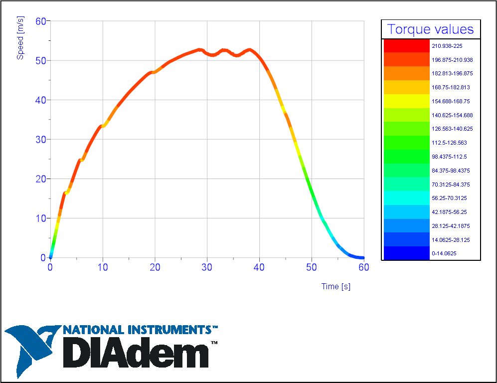
I went ahead and created a graph that I think represents what you are looking for. This is a 3D graph, with the color representing the torque values.
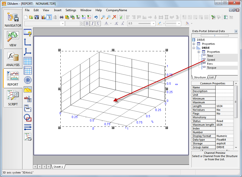
1 step - insert a 3D axis system onto a page:
2 step - add data to 3D axis system:
Select the 3 channels you want to display in the DataPortal, with the X-axis first, the Y-axis second and the Z-axis third. Then drag them into the 3D axis system:
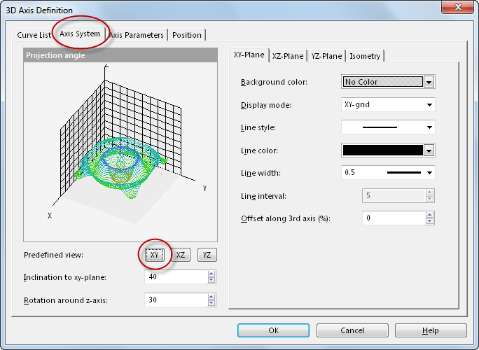
Step 3 - set the correct parameters for the 3D axis system display by double clicking into the axis system. In the dialog click on the "Axis System" tab and set the parameters as shown below:
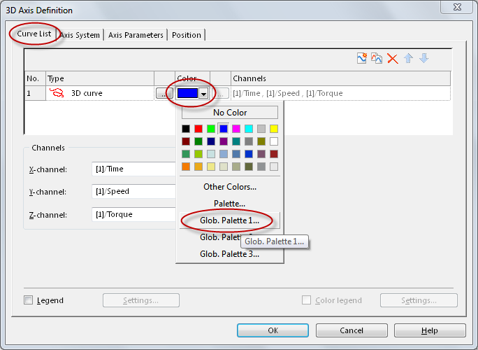
Step 4 - Click on the "Curve List" tab and select the color parameters as hown in the dialog below. The "Global Palette" selection will change the curve to a single color (blue) to multip color as defined in the global palette. The colors will represent the values in the Z-axis (torque).
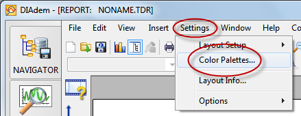
Done - now you have a curve with the colors representing the Z-values (torque). You can change the Global Palette in the Settings menu (see screenshot below):
Let me know if you have andditional questions,
Otmar
10-26-2011 05:28 AM
- Mark as New
- Bookmark
- Subscribe
- Mute
- Subscribe to RSS Feed
- Permalink
- Report to a Moderator
That´s exactly what i wanted. But how do i make that legend that you put in the first graphic for the torque values?
10-26-2011 08:08 AM
- Mark as New
- Bookmark
- Subscribe
- Mute
- Subscribe to RSS Feed
- Permalink
- Report to a Moderator
Hi Marcus,
You need to double-click on the 3D graph and check the Legend checkbox in the lower left hand corner of the dialog in order to make the legend appear. After that you can click on the "Settings" button to the right of the "Legend" checkbox to change the appearance of the legend.
Brad Turpin
DIAdem Product Support Engineer
National Instruments
10-27-2011 02:26 PM
- Mark as New
- Bookmark
- Subscribe
- Mute
- Subscribe to RSS Feed
- Permalink
- Report to a Moderator
Hello Marcus,
Here is what Brad was talking about:
Ciao,
Otmar
10-31-2011 04:32 AM
- Mark as New
- Bookmark
- Subscribe
- Mute
- Subscribe to RSS Feed
- Permalink
- Report to a Moderator
Thnx guys it works perfectly.
01-12-2012 04:47 PM
- Mark as New
- Bookmark
- Subscribe
- Mute
- Subscribe to RSS Feed
- Permalink
- Report to a Moderator
i HAVE A VWR TRACEABLE HYGROMETER/THERMOMETER. i WANT TO READ AND LOG THE DATA. IN HYPERTERMINAL, THE DATA OUTPUT IS IN GROUPS. EG. IT SPITS OUT TEMPERATURE 5 TIMES, rEL. HUMIDITY, NEXT 5, DEW POINT FIVE TIME AND THE CYCLE BEGINS. hOW DO I SORT THESE DATA AND DISPLAY IT IN LABVIEW? i AM A BEGINNER!!!!!
05-06-2020 09:35 AM
- Mark as New
- Bookmark
- Subscribe
- Mute
- Subscribe to RSS Feed
- Permalink
- Report to a Moderator
Hi,
Can we fix color values in palate to fixed range. So each color will have meaning. e.g Green color will be under desired range for particular signal and Red will be not.
Thanks in advance.
05-22-2020 03:43 PM - edited 05-22-2020 03:46 PM
- Mark as New
- Bookmark
- Subscribe
- Mute
- Subscribe to RSS Feed
- Permalink
- Report to a Moderator
Hi Sovarian,
Yes, that's what the "Palette" curve color is for. Here's an example that works with the default data set that loads in DIAdem.
Brad Turpin
Senior Technical Support Engineer
National Instruments
05-22-2020 04:11 PM
- Mark as New
- Bookmark
- Subscribe
- Mute
- Subscribe to RSS Feed
- Permalink
- Report to a Moderator
Thanks Brad_Turpin for the reply!
However I am not able to open the attached report.
It says, "file import was aborted with error 501"
