- Subscribe to RSS Feed
- Mark Topic as New
- Mark Topic as Read
- Float this Topic for Current User
- Bookmark
- Subscribe
- Mute
- Printer Friendly Page
Failed to plot multiple plots
Solved!04-18-2017 08:01 AM
- Mark as New
- Bookmark
- Subscribe
- Mute
- Subscribe to RSS Feed
- Permalink
- Report to a Moderator
Hi all
I'd like to plot several values through time in one graph/chart (i always forget which one i need).
Now I've set up an example of how I want my interface to look like, but when I plot the data, instead of each datapoint having a different line, they just represent as one point in the plot. (see images for more clarity.)
There's also a bit of double work i think, if someone could help me solve this aswell, but the main problem is the graphs/charts
Solved! Go to Solution.
04-18-2017 08:27 AM - edited 04-18-2017 08:29 AM
- Mark as New
- Bookmark
- Subscribe
- Mute
- Subscribe to RSS Feed
- Permalink
- Report to a Moderator
Hi Xebe,
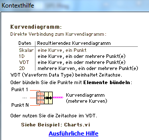
did you read the context help for charts? It explains how you need to present your data!
For several plots in a chart you either need to provide a 2D array (plots per row) or an array of clusters:
(As a Dutch guy you probably can read the German text… :D)
04-18-2017 08:35 AM - edited 04-18-2017 08:42 AM
- Mark as New
- Bookmark
- Subscribe
- Mute
- Subscribe to RSS Feed
- Permalink
- Report to a Moderator
So how would I get the 2D or array of clusters starting from what I have now?
And I'm belgian not Dutch, makes it even eassier to understand some German.
Edit:
I need the plots per parameter, so per Temp, pressure and flow. Which I first have to extract from the cluster i already have
04-18-2017 08:39 AM
- Mark as New
- Bookmark
- Subscribe
- Mute
- Subscribe to RSS Feed
- Permalink
- Report to a Moderator
Hi Xebe,
how would I get the 2D or array of clusters starting from what I have now?
How to create a cluster is shown in the context help. Building an array of clusters is easy with a BuildArray node…
The same applies to arrays: you already know how to build a 1D Array. What happens when you again use BuildArray on your 1D array?
(This is pretty basic LabVIEW stuff so I guess you know the answer! :D)
And I'm belgian
The words are so similar… 🙂
04-18-2017 08:46 AM - edited 04-18-2017 08:57 AM
- Mark as New
- Bookmark
- Subscribe
- Mute
- Subscribe to RSS Feed
- Permalink
- Report to a Moderator
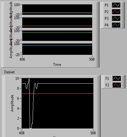
So now I have this:
That's a step closer to what I wanted, however, how do I add a legend to it so that I know which colour represents what?
And I want to split per parameter (so temp, pressure and flow)
FYI: Also we speak and write the same language, it's just a different nationality 😉
EDIT:
Okay fixed it, the solution lies in my own answer 😛 for the different parameters part
only gotta find how to add a legend now
EDIT 2.0:
Found the answer again 😛 resizing is always an option apperently.
Well thanks for the help 🙂
04-18-2017 08:57 AM
- Mark as New
- Bookmark
- Subscribe
- Mute
- Subscribe to RSS Feed
- Permalink
- Report to a Moderator
04-18-2017 08:58 AM - edited 04-18-2017 09:04 AM
- Mark as New
- Bookmark
- Subscribe
- Mute
- Subscribe to RSS Feed
- Permalink
- Report to a Moderator
I noticed 😄 but thanks for reminding me.
(I was confused by the 'autosize plot legend')
Edit:
Did something wrong, I want the bottom type, but the top one somehow changed :s
Edit 2.0:
The overlay function 😛 found it again. I'm a mess


